Opposites Attract: Complementary Color Combos
http://www.decor-ideas.org 10/10/2015 20:13 Decor Ideas
In the hands of an expert, even the most jarring color combinations look wonderful. A case in point are complementary color schemes. Essentially, these include two hues that sit directly opposite each other on the color wheel. The most common couplings consist of one primary color (red, yellow or blue) and one secondary color (green, purple or orange), although there are tertiary pairings that are considered complementary too. Inspired by the schemes below, you too can create a bold new look at home.
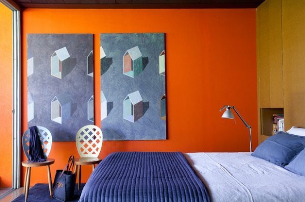
Blue and Orange
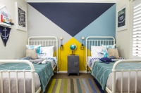
Strike a balance. Steely blue and punchy orange are the most dynamic and, some might say, contemporary of the complementary color couples. When used in equal parts, as seen in this bedroom, the effect of the two together can be relatively soothing, since neither color dominates.
A safer method of successfully combining complementary colors is to use subdued variations of the pure hues. For instance, if there appears to be a bit of a clash when attempting this at home, choose a primary that’s lighter (pale blue), darker (Prussian blue) or duskier (denim blue). They’re all still blue, but each is a derivation of the primary color, achieved by adding a neutral — i.e., white, black or gray — to a paint, dye or stain. Adding white creates a tint (such as pale blue), adding black creates a shade (such as Prussian blue) and adding gray will produce a tone (such as denim blue).
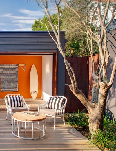
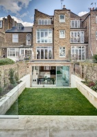
Lean on local color. Add a little black to a color and you’ll get a shade, which is why the exterior of this home looks more stormy charcoal than cheerful blue. However, it’s far from dull when framing an eye-popping orange — the shady blue intensifies the interior’s citrus-colored feature wall and the effect, I think you’ll agree, is striking. Colors readily found in the local environment, such as the tones and shades of the sea (blue green) and sand (yellow orange), are ideally suited to this Bondi Beach home in Sydney, Australia.
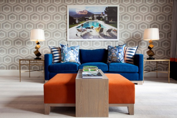
Add or subtract. Decorating a room with complementary colors can be quite daunting and, yes, can go badly wrong. However, there’s a way to play it safe until you get more confident in finding the right balance. Introduce one orange and one blue piece of furniture into a monochromatic scheme. The furniture can easily be moved around to see what works, or you can take one of the pieces out if there’s a clash, though this is unlikely if you’re toning down their loudness with a neutral palette. Here, for example, you can see how a mushroom wallpaper and cream carpet keep the vibrancy of the peacock blue sofa and persimmon orange ottoman in check.
Purple and Yellow
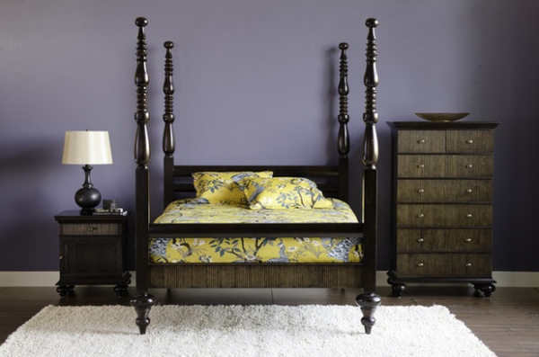
Go for softness. These two opposites are the odd couple of complementary colors, since neither is particularly easy to use on its own, let alone in partnership with others. Yet when purple and yellow come together, they make such beautiful music. Take this sweet bedroom setting. The purple wall could steer the atmosphere into melancholy if not for the sunny yellow linens on the dark four-poster bed.
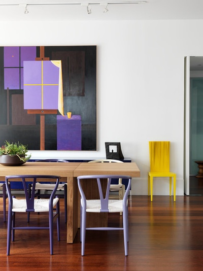
Dare to be cutting-edge. Complementary colors can be cutting-edge design features, since not many people know how to pair them successfully. In this award-winning New York City loft dining room, purple and yellow make a statement by way of designer chairs and a large abstract painting.
See more of this project
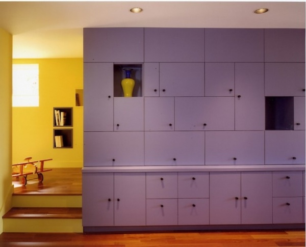
Color-block for boldness. Complementary colors can be particularly dynamic together when offered in equal parts, since they play up each other’s intensity. Here, a large purple cabinet unit is surrounded by canary yellow walls, creating just the right amount of vibrancy and energy from both colors.
Red and Green
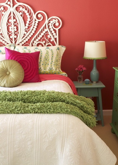
Play with variations. It’s hard to think of red and green together without thinking of Christmas, but they can indeed work in a modern palette. This is particularly true when the two are presented as tints, tones and shades of the unadulterated forms. In this bedroom, a lovely jewel box look has been achieved because the green has been offered as mint, olive and moss, and its opposite, red, shows up as cherry, rouge and coral. The addition of a neutral in the form of the white headboard, bedspread and lampshade help break up the concentration of so much red and green.
10 Color Combos You Never Thought Would Work
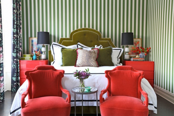
Call in a neutral. Using color effectively can be one of the most powerful tools in interior design, particularly if the designer is confident enough to use opposites in a room. To be effective, however, there must be balance, and this is commonly achieved by using a neutral color to moderate any potency. Here, the intensity of the red and green is broken up by lots of white in both the striped wallpaper and the bed linens.
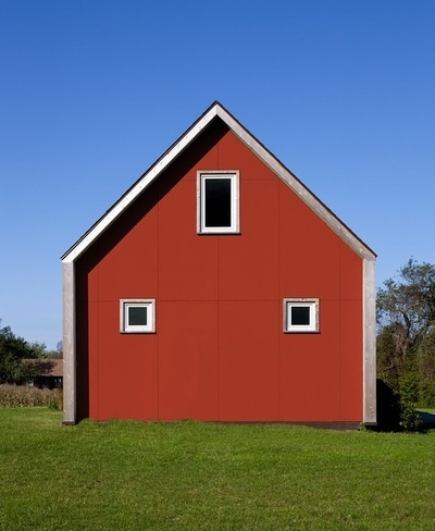
Use the landscape. The saturation of color looks particularly appealing outdoors: A red barn-shaped house on a verdant green lawn creates an extraordinary contrast of color and shape against the intense blue of the sky.
Tell us: Do you like to use complementary colors in designing and decorating your home? What is your favorite complementary pair? Tell us in the Comments section.
Browse more stories on combining colors
Related Articles Recommended
Related Images Recommend