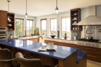
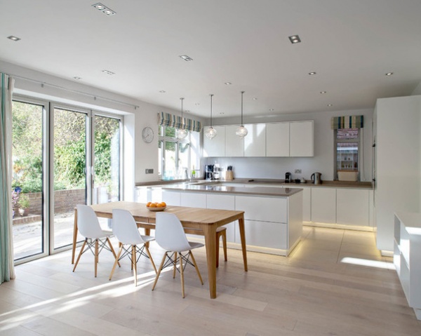
Bright Modern Kitchen With Smooth Lines and a Relaxed Vibe
http://www.decor-ideas.org 08/25/2015 03:13 Decor Ideas
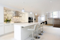
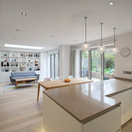
When designer Sue Murphy first took on this light, bright and airy open-plan kitchen-dining area in a semidetached Edwardian house, she knew the key was getting the zoning just right. “I didn’t want it to look like one confused mess,” she says. “I wanted to clearly define all the different living areas.” The space Murphy tackled was located in a new addition stretching across the width of the house — an old addition had been pulled down and rebuilt to make way for a second story. And with three young children in the picture, practicality was key.
Kitchen at a Glance
Who lives here: A professional couple with 3 young children
Location: Harpenden, Hertfordshire, England
Designer: Sue Murphy
Glazed doors leading to the garden ensure that this is a light, bright space in which to hang out. “It has a really relaxed, daytime-y feel,” Murphy says. “The kids can play in the garden while the grown-ups have a coffee at the table. Everything is very safe and thought-out to fit in with family life.”
The flooring is engineered wood with a light, whitewashed finish chosen to match the Edwardian boards in the hallway. The tiles in the kitchen area are porcelain but blend in beautifully.
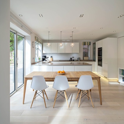
The white and wood Eames DSW chairs are classics that stylishly nod to the 1950s, an era the client is inspired by. The table is by Danish designer Ebbe Gehl.
Chairs and Ebbe Gehl table: John Lewis
“The client wanted something simple and warm, not overly trendy,” Murphy says. “We aimed to create a look that was contemporary and felt very now, while also being timeless — that wouldn’t easily date.”
The homeowner loves 1950s style, particularly shades of moss green and teal blue — and at one point she and Murphy even looked at using retro burnt oranges. However, after considering how the family lives, Murphy suggested more of a blank canvas. “I realized that was more appropriate,” she says. “Because they have young children with tons of toys and books that add color, as well as a beautiful collection of ceramics, I felt they didn’t need a lot of extra things to make it look bright.”
However, there are still some subtle color choices that reflect the client’s vintage tastes — in particular, those blues and greens on the blind and curtains, and in the rug in the living area.
While the homeowner loves grays as well, in the end she chose a mushroom-colored Caesarstone countertop to add warmth and elegance. “Gray would have looked colder,” Murphy says.
Countertop: Caesarstone
The stylish wooden kitchen table gets lots of use for playdates and craft sessions. The family spends much time here, the designer says.
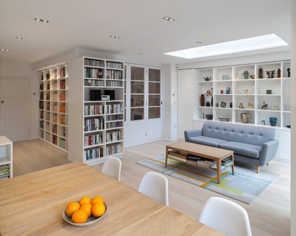
The dining area leads directly to the living area, which is defined by a skylight. The built-in shelving opposite the kitchen was specially made to show off a much-loved collection of ceramics (including a large pot by the client’s mother).
This might be an open-plan space but, as Murphy says, it never feels “empty and echoey.” Instead, the different zones flow together beautifully while retaining their distinct purposes.
Borough sofa: Sofas & Stuff; rug: Rug-Maker
The owner wanted cabinets that were sleek and simple, with no visible handles. “She didn’t want any bits of aluminum. And she really didn’t want a gloss white finish, so we chose a matte white, which took a little while to source,” says Murphy, who finally installed a German brand.
A well-camouflaged door on the right, next to the cooktop and fridge, leads to the utility area. It’s a swing door, so no hands are required to push through — handy for someone carrying trash bags.
Kitchen cabinets: via Brynmôr Interiors
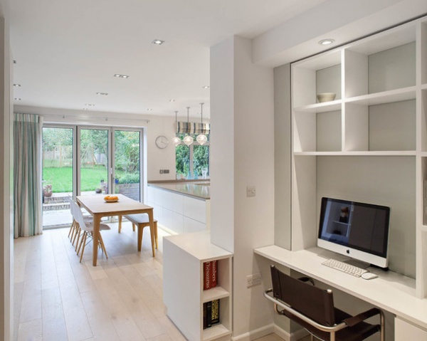
The central area of the ground floor was previously part of the kitchen but was a dark, windowless space, Murphy says. (See the “before” shots below.) Now, thanks to the removal of the internal walls, it flows naturally from the living-dining area. “There’s a nice flow to the whole space,” Murphy says.
The family wanted to avoid a corridor feel. Murphy’s inclusion of a desk within the run of bookshelves allows them to show family photos on the computer and use it to help with homework.
All custom cabinetry supplied and installed by AWH Joinery
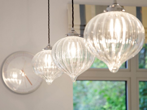
The teardrop-shaped glass pendant lights are handcrafted and add some sparkle and glamour to the kitchen. “They are actually quite traditional,” Murphy says, “but hung together in this kitchen, they look modern.”
She worked hard to create a lighting plan that was versatile, with adjustable circuits over countertops and living areas, and slick double spots in the ceiling. “The space is really cozy at night as well — it’s not just a daytime space,” Murphy says.
Lights: Jim Lawrence
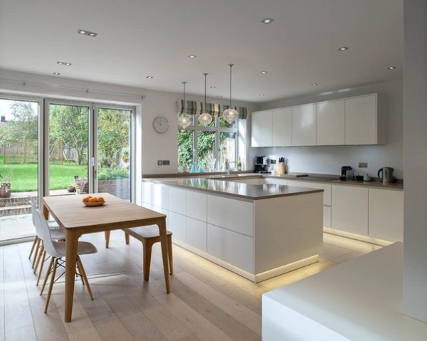
A peninsula, rather than an island, was chosen to separate the cooking and dining areas — stopping kids from running around while the owners juggle hot pans and dirty dishes. “The peninsula still looks modern, because of the symmetry and layout,” Murphy says.
While she did follow the kitchen triangle rule, the family’s specific needs were more important — including their love of tea. “Triangles are worth bearing in mind, but what’s also important is how people actually use the space. It started as a joke, but one thing they really wanted was a tea station. Now you can make a cup of tea without moving your feet! The kettle, cupboard for teabags and cups are all close together.”
With the dining area so close by, the family decided they didn’t need a breakfast bar. But they do have some bar stools tucked away out of sight that they can pull up to the kitchen counter when the children want to help with cooking.
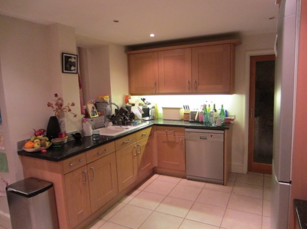
BEFORE: This is the kitchen before the renovation.
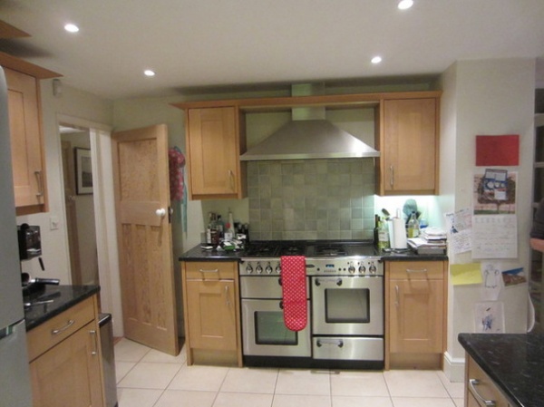
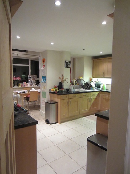
BEFORE: The old kitchen, above and at left, felt much gloomier and was in need of a face-lift.
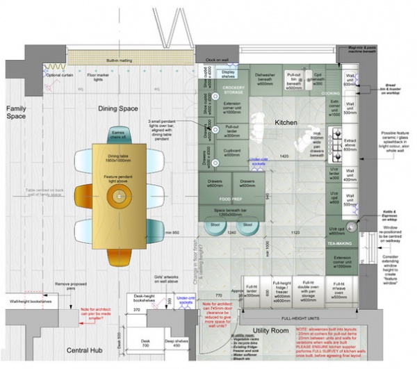
This floor plan includes the utility space, dining zone and kitchen cabinets. Note the must-have tea station and extensive storage. Everything was thought of, even the right spot for a wall clock.
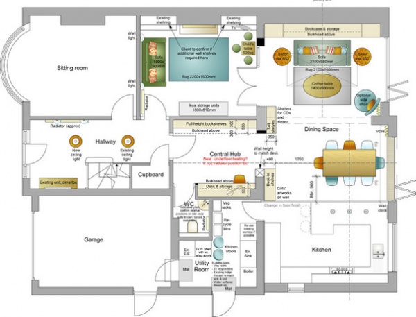
This floor plan shows the entire ground floor.
More
How to Keep Your White Kitchen White
Dream Spaces: 12 Beautiful White Kitchens
Related Articles Recommended
Related Images Recommend