Small Kitchen Gets a Fresher Look and Better Function
Good things come to those who wait. Mike and Lisa Jacobson of Eden Prairie, Minnesota, spent 11 years living with the original dark and cramped 120-square-foot kitchen in their two-story home, built in the 1970s. It had an obtrusive vent concealed in a walled-in portion that cut into the room and a standard-depth refrigerator that interrupted traffic flow.
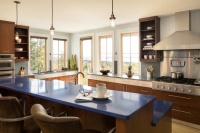
The Jacobsons hired kitchen designer Kristen Peck, who removed the vent wall and borrowed space from the adjacent dining area to improve circulation. To update the 1970s look, she introduced an inviting and timeless warm gray color palette, custom white enamel cabinets, granite counters, a focal-point backsplash behind the range and a red oak floor with a custom ebony and dark walnut stain.
Kitchen at a Glance
Who lives here: Mike Jacobson, who works for a liquor distributor; his wife, Lisa, a national sales manager for a hair-care company; and their daughter, Abby, 12
Location: Eden Prairie, Minnesota
Size: About 120 square feet (11.1 square meters)
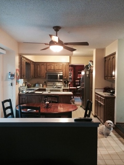
BEFORE: The existing kitchen felt dated and cramped, with a popcorn ceiling and standard dark oak cabinets with a soffit that seemed to push everything down. There were also laminate counters with a wood edge, beige walls, mismatched appliances and just two fixtures providing lighting for the entire kitchen — a small light fixture above the sink and a ceiling light.
One of the big elements that impeded traffic flow and limited appliance selection and placement was a walled-in vent from an old water heater and furnace that cut into the kitchen, seen to the right of the refrigerator.
“It was a not-so-pretty part of the wall that stuck out,” Lisa Jacobson says.
“After” photos by Mark Ehlen of Ehlen Creative Communications
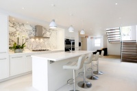
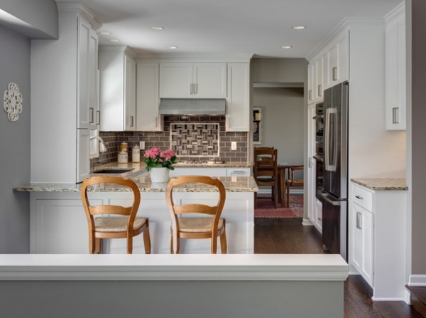
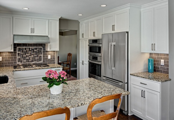
AFTER: The old water heater, furnace, vent and wall portion were removed and replaced with a new high-efficiency direct-vent furnace and water heater. “This made the whole kitchen feel more connected,” says designer Peck, of Knight Construction Design Inc.
Eliminating the obtrusive vent wall allowed room for new double ovens. The new stainless French-door refrigerator is counter depth, as opposed to standard depth, which helps keep the traffic flow unimpeded. The couple saved money by going with an appliance package that included the refrigerator, combination microwave and convection oven, standard oven, five-burner cooktop and dishwasher. “We love the look of the stainless steel and the clean lines,” Jacobson says.
The kitchen was expanded into the former dining area, allowing for a larger window over the sink. An extended peninsula counter and a custom bench with storage underneath and a custom table replaced the round dining table and chairs seen in the first photo.
Wall paint: Dorian Gray SW 7017; ceiling paint: Ceiling Bright White SW 7007, both by Sherwin-Williams; appliances: Bosch
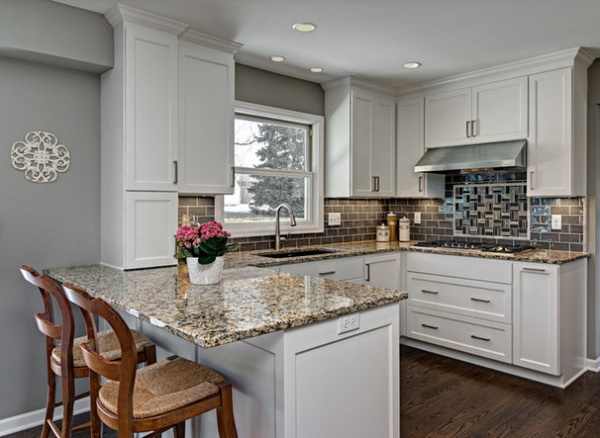
The Jacobsons felt the color of their previous kitchen had to change. “Sometimes beige can suck the life and light out of a room,” Peck says. A warm gray palette in soft tones created a more classic look.
Venetian Wave granite in a mostly light honey color with amber, black and cream flecks offers lots of movement and visual interest. “We just wanted something that would be durable and not stain like other materials would,” Jacobson says. “When we picked the color, I knew I wanted white cabinets and a dark floor, and this was the perfect complement.”
Taupe ceramic subway tiles were chosen for the main backsplash to not compete with the countertops. A rich red oak floor with a custom ebony and dark walnut stain replaced the aging linoleum.
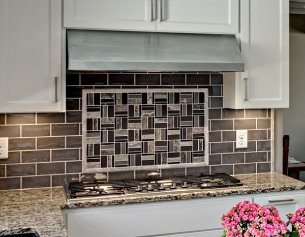
A custom focal-point mosaic of stainless steel, frosted glass and stone — materials chosen to highlight the other finishes in the kitchen — lies behind the range. “Your eye is definitely drawn to it,” Jacobson says.
Backsplash mosaic tile: Tile By Design; backsplash field tile: Rubble Tile
Peck removed the soffit to take the custom white enameled cabinets with crown molding to the ceiling.
A tall pantry cabinet to the left of the ovens features four roll-outs. The long drawer to the right of the refrigerator is a hidden charging station.
After the old popcorn ceiling was removed, recessed lights were added for ambient lighting, while undercabinet lights brighten task areas. (A pair of mercury glass mini pendants was added over the peninsula after these photos were taken.)
Cabinets: custom; cabinetry hardware: Top Knobs; hood: Vent-A-Hood; recessed lights: Juno Lighting Group
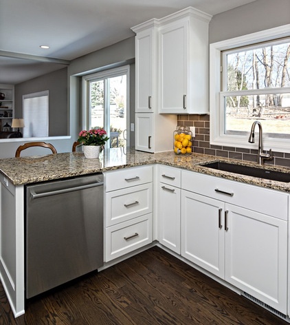
The sink window expanded from 28 to 42 inches to allow as much natural light in as possible, and to ease the crowded feel of the former sink area.
The new low-divide sink in a soft dark brown color has a hands-free faucet. The long, wide drawer under the sink has a tip-out feature for storage of sponges and other sink essentials. The stainless dishwasher is located just to the left. “Doing a paneled front would add more cost,” Peck says. “The stainless coordinates with everything else, and it’s only visible from inside the kitchen.”
The tall white cabinets above the counter in this photo have usable space that’s only 3 inches deep. A vent pipe that runs from the basement to the second floor of the home that couldn’t be removed is hidden behind them. “This was our way of working around it,” Peck says. The cabinets hold a bulletin board for notes up top and dog treats at the bottom.
Sink: Blanco; faucet: MotionSense, Moen
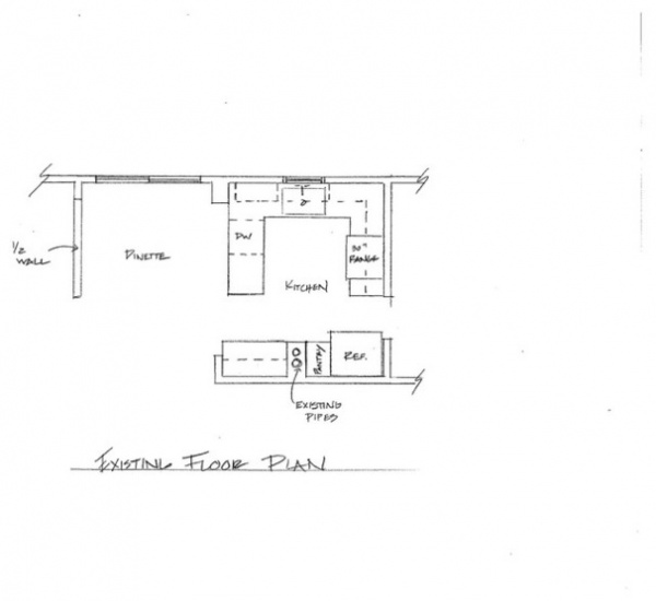
BEFORE: The floor plan of the previous kitchen illustrates its compactness, with the old refrigerator sticking into the path of traffic flow. The plan also highlights how the adjacent dining area seemed overly spacious compared to the tight kitchen.
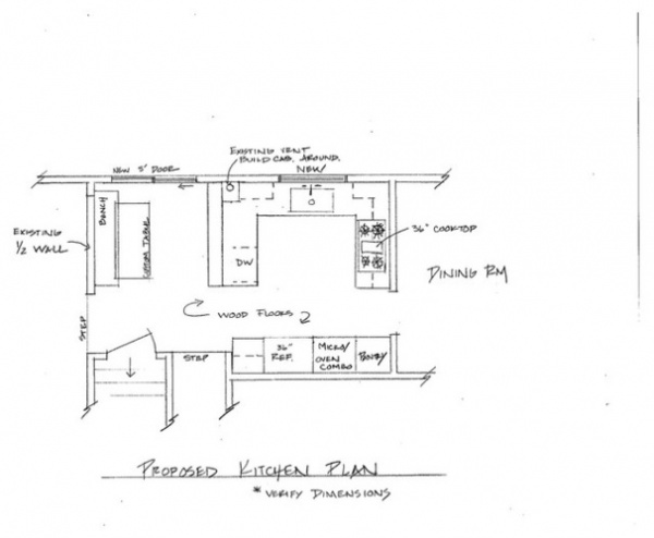
AFTER: The new plan shows how the kitchen got pushed into the dining space, allowing some breathing room. “What I love is that it’s not only a beautiful kitchen, it has great function too,” Jacobson says. “It’s easier to cook in, and it’s fun to be in too.”
Browse more stories about small kitchens